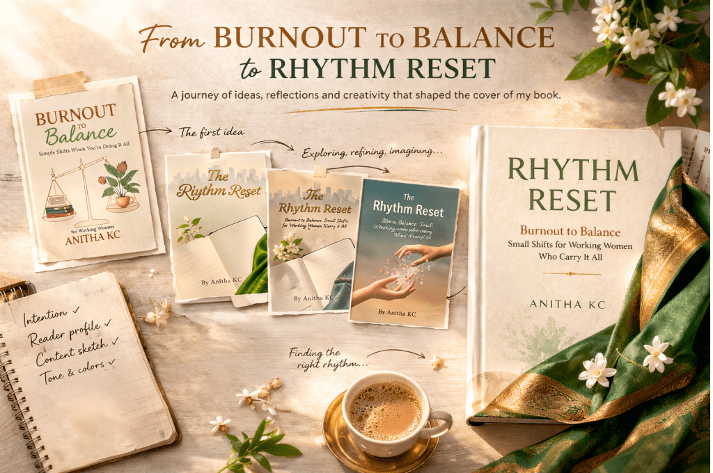
In my previous blog, I shared how I initially considered naming the book “Burnout to Balance.”
Once that name settled in my mind, I made a quiet commitment to myself that this time, I would treat the book as a project and see it through, no matter what. Having experienced earlier setbacks with unfinished manuscripts, I didn’t want to leave anything to chance. More than anything, I needed to strengthen my belief that I could complete it.
That is when I decided to start with something tangible, the cover.
Even before the content was fully written, I wanted to see the book. I wanted it to feel real.
I took the help of Gemini and created an early version of the cover. The idea was simple — a visual representation of balance. On one side, there was a laptop, symbolising work. On the other hand, elements like coffee and plants represent rest and life beyond work.
I was also very clear about the colours I wanted. I didn’t want anything loud or overwhelming. I was drawn to grounded tones — off-white, soft greens, and earthy browns — colours that feel calm and steady.Seeing my name on that cover, even in a draft form, made a difference. The book was no longer just an idea; it had begun to take shape.
I shared this early version with a few close friends and family members, and that encouragement helped me move into the next phase with more confidence. At that stage, my reader was also becoming clearer.
I write for women who carry a lot, whether at home, in the office, as freelancers, running a business, or navigating multiple roles in various ways. Wherever they are, the kind of load they carry is remarkable.
We often talk about balancing work, family, and responsibilities. But we rarely talk about another kind of balance — the one between yourself and the rest of the world. You need to remember that your life matters too, even as you try to be everything for everyone.
That is why the idea of balance felt so natural at that point, both in the title and in the cover.
As the book progressed and the draft slowly took shape, something else began to evolve alongside it — the name. During multiple rounds of editing, the title shifted from Burnout to Balance to Rhythm Reset. With that change, the earlier cover no longer felt aligned. It had served its purpose in helping me begin, but it now belonged to an earlier phase of the journey.
In a way, that cover became obsolete, not because it was wrong, but because the book had grown beyond it.
Once the content was ready and the new title had settled in, I found myself reimagining the cover again. This time, the process felt more intuitive.
Between edits, ideas would come and go, filter coffee, a jasmine plant, the pallu of a silk saree, a cityscape, the silhouette of a woman, even the idea of coffee steam forming into a feminine figure. I explored different combinations in my mind, such as minimal, layered, and symbolic.
Each idea reflected a part of the story. Then one day, while watching a saree advertisement, I was drawn to the elegance of the pleats. There was structure, flow, grace, and rhythm, all held together effortlessly. That image felt right.
I knew I wanted to include a saree or at least a part of it in the cover. My protagonist, Meera, wears a silk saree, and it felt like a natural way to bring an Indian touch into the design. It was not just an aesthetic choice; it felt personal.
I spent hours experimenting. I folded and refolded, fussed over the pleats, and played with the lighting from every possible angle. But looking back at the screen, none of the photos felt right. They were just images, missing that specific spark I was trying to hold onto.
Finally, I decided to go for AI support to recreate the pleated look more beautifully. I wanted the reader to feel calm and special when they saw the book, not overwhelmed by too many elements. The front page is finalized.
At the same time, I was still holding on to another idea. Meera has a notebook in the story, and I wanted that to appear on the back cover. I carried this thought with me almost until the final stage. Then came the last day.
I was placing a novel back on the shelf when I noticed something simple: the book had the same tone across both the front and back covers. That continuity felt clean and complete.
It sparked a thought. Instead of introducing a different background for the back cover, what if I carried the same green from the saree across, and used a similar tone for the text?
I tried it. And for the first time, everything felt aligned.
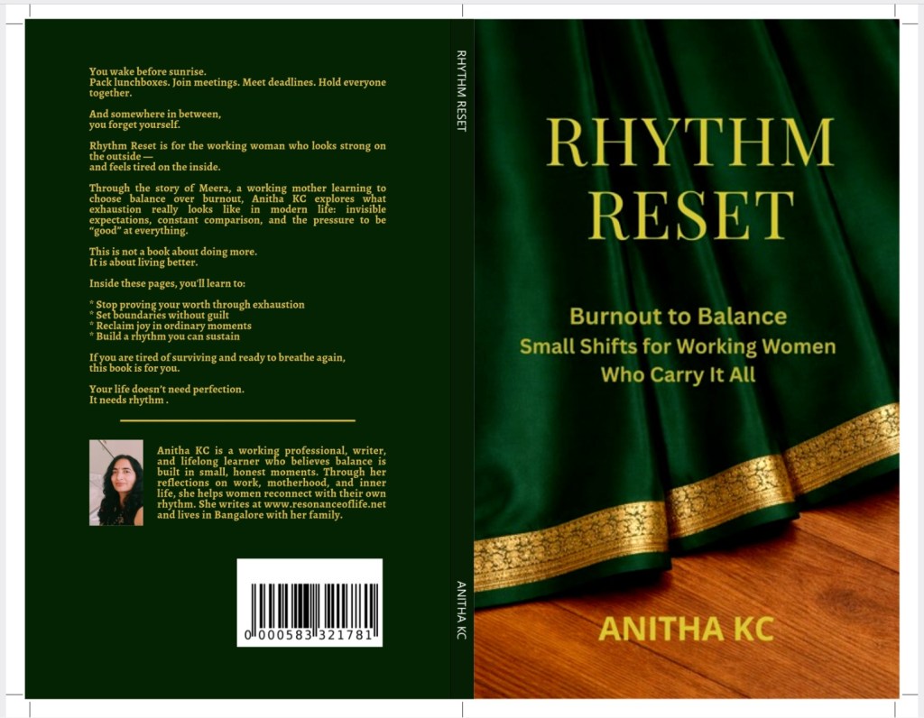
The saree pleats became more than just a design element. They began to represent the many layers we carry, thoughts, responsibilities, emotions — all held together in a quiet rhythm. Also, the multiple roles women play in their lives that keep adding one more fold & they handle them gracefully like the pleats of a saree.
At the same time, the cover had a gentle, almost gift-like feel. Something you would want to hold, not just read.
That final version came together on 27th February and stayed with me. It is the evening my publishing Notion Press coordinator Preethi, tried to incorporate the changes and suggestions, and went beyond her working hours to ensure my work went live on the same day, the day my dream of becoming a published author came true.
Interestingly, at a recent book signing event, the host told me she loved the cover and wanted to buy a saree that looked exactly like the one on it.
I smiled a little sheepishly and told her the truth.
“I actually ordered one online based on a photo,” I said. “It looks completely different in real life… and I couldn’t even return it.”
“Let me know if you find one,” I added. “I’m still looking for it too.”
Looking back, the cover, like the book itself, did not arrive in one attempt. It evolved through ideas, pauses, experiments, and small moments of clarity.
In the next blog, I’ll share what writing this book taught me beyond the words, and into the way I now think about life, work, and rhythm.
With warmth,
Anitha

Leave a comment